You have seen it before. Adorned in houses, offices and most likely line the counters in some of your mothers kitchen. Whether or not you know the name, the font is everywhere.
This raises the question: What is it? Why is it so prevalent?
And more importantly: How can we stop this terrible epidemic?
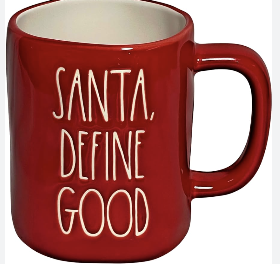
Rae Dunn is a homeware brand that focuses mainly on pillows, frames, but is best known for their ceramic containers and mugs. They have a minimal look, mostly being all white with some kind of phrase or word etched into the mug in a contrasting colored ink.
Now this hardly seems controversial. However, it is not the quality of the mugs that a portion of the public has an issue with, it is the quantity. The proliferation of products with the same style, theme, motif, or for more accurate depiction, lack thereof has quickly taken over the aisles in stores such as Target, TJ Maxx, Home Goods, All Home and Hobby Lobby.
“They are pretty bland and conventional looking” says junior Daphne Linn, and junior Addie Whitmyer agrees, describing the font and style as “stupid and useless.”
Additional to their bland and repetitive exterior, their slogans and phrases pictured on their products are confusing and cringe-worthy. With things like “slurp” on dog bowls, “Toast,” complete with a period at the end to affirm the obvious, and “Santa, define good,” Rae Dunn’s choice of captioning her products never fails to leave viewers confused as to why such a specific product needed to be labeled in the first place.
Overall, in a time where the world is at it’s peak creatively, technologically, and developmentally, labeling a toaster with the word “toast” seems confusing and pointless at best. Millennials adoption of the style has served to only harm the eyes and souls of all subjected to it, therefore making its elimination vital.

